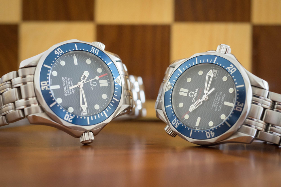
“The watch,” demands Alec Trevelyan, his henchmen holding James Bond at gunpoint. “Ah… new model?” he asks, closely examining 007’s Omega Seamaster against his own watch.
006’s Seamaster might have been long obsolete compared to Bond’s newer laser-equipped timepiece, but in the real world, only a couple of years had passed since Omega had unveiled its new and only Seamaster 300m to great acclaim in 1993. Twenty-five years later, Omega caught the watch community by surprise with the return of the beloved wave dial on its fan-favorite Seamaster 300m. This time around though, the waves have polarized the customer base. Some think the new laser-etched waves look modern enough for 2018. Others think they should be laid to rest, as Omega did in 2012 with the release of the ceramic Seamaster Diver. Myself? I have to admit I’ve always loved the original wave dials of the ‘90s, so I guess it’s time to revisit the classic blue wave-dialed variants: references 2551.80 and 2222.80, otherwise known as the midsize counterparts to the famous 2531.80 and 2220.80 models.
The Bond Factor
The original 2531.80 was launched back in 1993, but its greatest success came after pairing the watch with the new James Bond of the post-Cold War era: Pierce Brosnan of Remington Steele’s fame. Now, to be precise, 007’s watch of choice in Goldeneye was the quartz reference 2541.80, as some eagle-eyed viewers can confirm by closely observing the tick of the seconds hand and the three lines of text on the bottom half of the watch. The automatic version (2531.80) was featured in the three films that followed (Tomorrow Never Dies, The World Is Not Enough, Die Another Day), until Daniel Craig came along in Casino Royale wearing the upgraded 2220.80 model. Sadly, its appearance in the Montenegro casino sequence marked the last time the Seamaster 300m was seen on-screen, replaced in Quantum of Solace by the more technically advanced Planet Ocean line. However, 15+ years on the silver screen have forever associated the Seamaster 300m with the James Bond franchise in the minds of the audience.
Throughout this review, I’ll refer to both watches as simply “Seamaster”. Only when relevant I’ll call them out by their unique reference number. Furthermore, anything said about the 2551.80 applies to the full-sized 2531.80, too. The same goes for references 2222.80 and 2220.80.
Seamaster Wave Dial
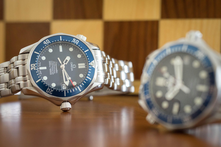
Arguably the most famous feature of the Seamaster comes in the form of the blue wave pattern on the dial. Decidedly a product of their time, the waves bring originality and charm to an already beautiful watch. Renders found online don’t tell the whole story. When the light strikes the dial just right, the waves shine back in an orderly, mesmerizing manner.
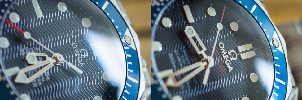
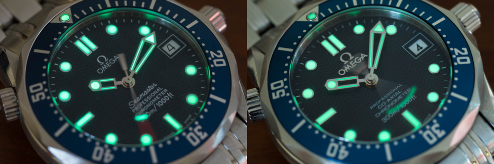
Often times reviled and some other times praised, the skeletonized hands are a constant point of contention. They have been unfavorably compared to the sword hands of the 2254.50 variant, and perhaps rightly so. Sword hands offer the obvious advantage of enclosing a greater amount of lume, thus increasing legibility underwater, but personally, I can’t imagine another set of hands on the blue Seamaster. A welcome splash of color on an otherwise cold dial can be found in the seconds hand red tip, which unfortunately tends to fade to white in some older models. There is a white date window at the 3 o’clock position, looking right at home with the hour markers (annoyingly enough, the date is not perfectly centered on my particular 2551.80). Purists will argue that no diver needs to know the date underwater, but let’s be honest here, how many people will take the Seamaster for a dive (desk-diving notwithstanding)? I find the date complication immensely useful for the fact alone that I’m often oblivious to the date I’m living on. The bottom half of the dial is occupied by several white lines of text, which, depending on the model you have, achieve varying degrees of success in balancing the visual weight of the logo in the top half of the dial.
The biggest upgrades in the newer 2222.80 are found in the dial. The most obvious difference stems from the applied logo and markers versus the painted logo and markers of the original iteration. Having handled the 2222.80 for some time now, there is something that has nagged me from day one: depending on the lighting conditions, the logo gets lost in the darkness of the surrounding waves. The metallic logo needs a bright surface to reflect light back from, and more often than not this isn’t the case, which results in the logo showing little to no contrast with the surrounding blue dial. What is even worse, whenever this happens, the watch face looks asymmetric due to the orphaned text in the bottom half of the dial, which is written in a rather thin font. Don’t get me wrong, when the light hits it right, the logo looks nothing short of amazing, but it’s a shame to see it getting lost in the darkness of the dial most of the time. It should be noted that the 2018 iteration of the Seamaster sees the return of the waves, this time with a printed logo on top of them. Has Omega noticed this little detail, too? It goes without saying that the printed humble logo of the 2551.80 is easily seen no matter the lighting conditions, perfectly balancing the visual weight on the dial.
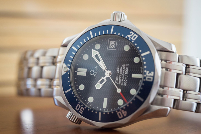
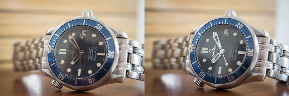
Visual subtleties are a matter of taste, though, as are the rest of the differences between these two classics. The applied markers of the 2222.80 offer an elegant feeling of three-dimensionality that the painted markers simply cannot achieve, and the refreshed font in the date window (2500D calibre only) is a welcome update. For those wanting an extra splash of color, the 2222.80 has the “Seamaster” brand signature written in a darker shade of red just below the applied Omega logo (thus earning the “Red Seamaster” moniker), creating a nice chromatic balance between the dial and the tip of the seconds hand. The size of the skeleton hands is different, too. Where in the 2551.80 the hour hand reaches just halfway between the center of the dial and the hour markers, the updated 2222.80 hour hand reaches three-quarters of the way.
A really subtle difference (which I’m not even sure is present in their full-sized counterparts) between the 2551.80 and the 2222.80 lies in the size of the hour markers. Unless my eyes are deceiving me, the printed original markers look ever so slightly larger than the applied ones, achieving something of a “maxi-dial” effect. They are not quite as big as the ones found in the 2018 Seamaster, but it is something that caught my eye immediately. At dusk, I can see that the printed markers are not completely filled with lume, so I guess that, while the applied markers can be neatly filled with Superluminova, the printed markers can’t undergo the same process lest the lume “spills” on the dial itself. Whatever the case might be, it is something worth paying attention to before buying. It’s also worth mentioning that the lume in both watches easily shines throughout the night.
Case
Distinctly recognizable from a mile away, the stainless steel case conveys a hint of elegance that makes the Seamaster look just right with either a pair of jeans, a suit, or (gasp) even a tux (just kidding, don’t do it, wear a proper dress watch, will you?). The exquisite alternating polished and brushed surfaces of the lugs, the scalloped bezel, the subtle yet functional crown guards, and the slim profile all come together to create the quintessential ‘90s diving watch.
As is the case with the skeleton hands, it’s worth noting that once again function trails behind form as far as the unidirectional bezel action is concerned. It is rather stiff and not easily operated. One can only imagine that the problem compounds when wearing gloves underwater. The bezel insert is made from aluminum which, unlike ceramic, will bear the scars and scratches (read: character) the watch will inevitably develop during its lifetime.
At 10 o’clock, we can find the oft maligned helium valve escape. Saturation divers need to work for days at a time in pressure-controlled environments enriched with helium to avoid oxygen toxicity. Being the smallest and swiftest element in the periodic table, helium atoms can seep through the seals and gaskets of the Seamaster. This isn’t cause for concern at great depths, but during the resurfacing process, the helium gas inside the watch could expand due to the drop in pressure. Therefore, the helium valve should be opened during decompression to avoid popping the sapphire crystal. More of a conversation starter than a useful tool in real life, critics often say it sticks out like a sore thumb. Personally, I think it’s quite an interesting accessory, even though I know I’ll never have the chance to operate it as intended seeing as I don’t plan on doing saturation diving any day soon. Even so, it doesn’t hurt to have it, and one can always pretend it’s a remote mine detonator, if nothing else.
The signed crown is an absolute pleasure to deal with. It can be engaged in three different positions after unscrewing it. In the normal resting position, the movement can be manually wound, the resulting mechanical feedback feeling buttery smooth. Turning the crown while on the second position quickly changes the date, a useful feature to have when the watch has exhausted its power reserve. The third position hacks the movement and allows for precise time-setting (I recommend using an atomic reference, such as the NIST website). The crown should always be screwed down to protect the insides up to a 300m water depth rating.
On the back of the case we observe an important difference between the two Seamasters. On the original iteration, the small Omega hippocampus is surrounded by the same wave pattern found on the dial. On the updated model, the hippocampus grows to cover the entire back of the case, and the wave pattern is discarded altogether.
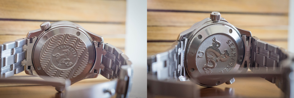
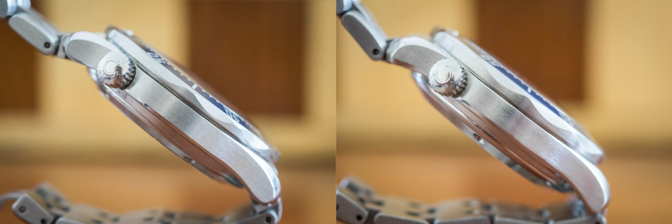
There is another important difference between the cases, this time due to the movements inside. The updated Seamaster is about 1 mm thicker than the original in order to fit the co-axial escapement. The difference in thickness seems to be evenly distributed throughout the case, meaning the bezel on the 2222.80 is easier to grab and turn. However, either watch is slim enough to fit under the cuff.
Movement
Powering the 2551.80 is the chronometer-certified Omega calibre 1120, itself derived from the tried-and-true ETA calibre 2892-A2. A solid workhorse, this widely respected ETA movement can be found in a variety of high-end Swiss watches. Omega added a couple of jewels and tastefully decorated the rotor. Advantages of the 1120 include its high frequency (28,800 bph, ensuring a smooth, sweeping seconds hand) and its repairability, as parts for this movement will probably be available till the end of time.
Proudly sporting a co-axial escapement, the Omega calibre 2500D can be found inside the 2222.80. Legendary English watchmaker George Daniels developed the co-axial escapement sometime in the 1970s, later selling the patent to Omega, which went on to develop its own in-house movements featuring the new mechanism. Omega however first tried fitting the co-axial escapement into the venerable 1120, meeting failure in the form of the first 2500 calibre. After some iterations (2500A, B, and C), Omega finally succeeded, giving birth to the calibre 2500D. Some compromises had to be made, though, the greatest of which was lowering the frequency of the movement to 25,200 bph. This slightly slower frequency can be detected when observing both Seamasters side to side.
Bracelet
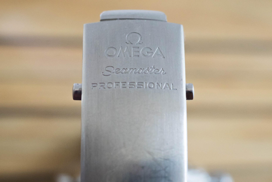
Another source of heated debate, the 9-link construction of the bracelet befits the aesthetics of the case. Held together by the old pins system, it is a definite part of the Seamaster’s DNA, and like it or not, it’s widely regarded as one of the most comfortable bracelets in the business. Its design makes it feel supple yet robust, as a tool watch ought to be. It might look dated by today’s standards, but let’s remember the time it was first launched. Oversized suits were the norm, color palettes were all over the place, neckties were thick, hairstyles were big and flashy. The ‘90s was a decade of excess and indulgence, and this bracelet complies with the aesthetic. There are some true negatives, though: first, it doesn’t taper at all. A missed opportunity, one that Rolex has already taken advantage of decades ago. Second, the clasp is a little bit too long for my taste. The hidden diver’s extension is a nice feature, sure, but I’d rather have a micro-adjustment mechanism. Also, no matter how well the watch is taken care of, the clasp will show scratches from day one. Then again, watches are meant to be worn, so one shouldn’t overly mind getting some scratches on the clasp every now and then.
Conclusion
So, which one do I prefer? This is no easy question, but if I had to pick, I’d go for the 2551.80. Something about the smaller hands, subdued dial and superior legibility speaks to me more than the flashier elements of the updated watch. There’s nothing wrong with the 2222.80, mind you; it’s a beautiful transition model with its own appeal, but in this case at least, I think less is more. Nonetheless, both Seamasters are solid timepieces and excellent performers that will serve for many decades to come.
What else can be said about the Seamaster 300m that hasn’t been said before? Unlike some timeless pieces like the Submariner or the Datejust, it might already look dated. However, this watch has an irresistible appeal for some of us who fondly remember the ‘90s. Its unapologetic design, relative affordability, undeniable versatility, and outstanding horological significance all contribute to make the Seamaster 300m an icon of the turn of the millennium and a terrific addition to any collection.
I own a 2551.80, two tone model with 18K gold bezel inlay, crown, and bracelet parts.
This was my first purchased “serious” watch, and it remains my daily wear as I simply like the way it feels. It was delivered with Chronometer COSC Cert., and I appreciate the simple elegance while remaining robust.
Wow, isn’t it a 2552.80? That’s a relatively uncommon model, congratulations!
Such a delight to read. Congratulations!
Thank you!
Nicely written and great attention to detail! Greetings from a left-handed, right-wearing, Seamaster-loving 2551.80 owner with small wrists.
My man! Such a wonderful little timepiece, isn’t it? Wear it in good health!
Best review on the watch that i should’ve acquired years ago.
As a 90’s teen growing up watching Pierce Brosnan in GoldenEye, this was THE watch i wanted.
The 2551 has so much character and charm and will pull the trigger once my i’ve saved enough by year end.
Thanks for the brilliant & comprehensive article!
Same here, still the crown jewel of my collection. Hope you get it by the end of the year.
Thanks for stopping by, have a great day!
Thanks for this nice article…Surely this omega seamaster whether in its midsize or full size, still remains a beautiful designed true tool watch for all occasions and can be a one watch to have! And year 90’s rocks!
Absolutely agreed! The SMP might very well be the perfect all-around watch.
Thanks for stopping by, have a great day!
I’m usually an anonymous internet troll but your article was so well written and detailed that I had to share kudos.
I’ve owned a 2551 in the past, sold it, and regret it. I’ll have to hunt one down after being educated by your article.
Thank you!
You’ve just made my day!
Thanks for stopping by and good luck with your search.
After searching for a while on both the 2531.80 and the 2220.80 and not finding one up to the condition i wanted….. i have just managed to buy a 2007 very clean 2220 with box and all the cards for just under 3K . Can’t wait for delivery and hope it measures up to description and photo’s.
Fingers crossed, good luck!
Great comparison and i was confused to go which one. Now I realize 2551 is better to collect because of its originality with first bond chronometer automatic. Even though laters are better in technology, origins are their base unavoidably.
I’m glad I could help. Thanks for stopping by!
Great article about an iconic watch. I fell in love with it while playing N64 Goldeneye in my teens. A year ago i bought the original 2551 and i proudly wear it almost every day.
My jaw dropped the first time I saw Pierce Brosnan using the watch laser to get out of the armored train right before it blew up. Of course, later I got to recreate that scene dozens of times on the N64. Great memories!
Thanks for stopping by.
Awesome review. Have a 2551.80 from the early 2000’s and a 2015 mid-size ceramic black 300m (with the coaxial). The 2551.80 is a stunning workhorse. It’s still keeping time 1/sec a day!
I used to have the full size ceramic black dial. Of course it wore like a dinner plate on my wrist, but I still miss it sometimes. That black ceramic bezel is simply to die for.
Thank you so much for stopping by! Have a great day.
Great comparison! The 2220.80 was my 1st foray into luxury watches. I still have it and will proudly give it to a future generation.
Lume is still great after all these years! Accuracy is also great. Very good watch indeed.
Such a great watch, isn’t it? Thank you for stopping by!
Great review. Not sure why you focused on obsolete mid-sized versions. You are the only one to mention the troubling matter of the reflectivity issue in the applied logo. The problem with the “upgraded” version is that it fixes “problems” that were actually endearing features in the original. I never noticed the alleged “problems” with the short hands, or painted indices, or “cold” dial until they were pointed out. It’s like teaching kids about “racism.” They wouldn’t have viewed the world in such nasty terms – unless they were taught to! The original SMP is the best. All subsequent “revisions” are creating a new and different watch.
I focused on the mid-sized versions due to my small wrists. Agreed, the original SMP is the best iteration by far.
Thanks for stopping by!
I really enjoy this reading. May you give me some hints about quartz versions? Thanks to you I know I have 2551.80, and I just bought a quartz version for my wife.
Sure! The quartz versions of the Brosnan SMP are the 2541.80 (full size) and 2561.80 (midsize).
Thanks for stopping by!