It’s almost as though Seiko knew the complaints I had about their model SNE098 and then made the SGF204 to fix the problems. Obviously, this isn’t true, but this watch got rid of the red font in the dial window and went to standard black, and that alone makes this watch really appealing to me. Basically, everything about this watch, other than the solar-powered display, is a huge improvement. But alas, this isn’t a comparison of the two. It’s its own review, so let’s get right into it.
SGF204 Clean Elegant Style
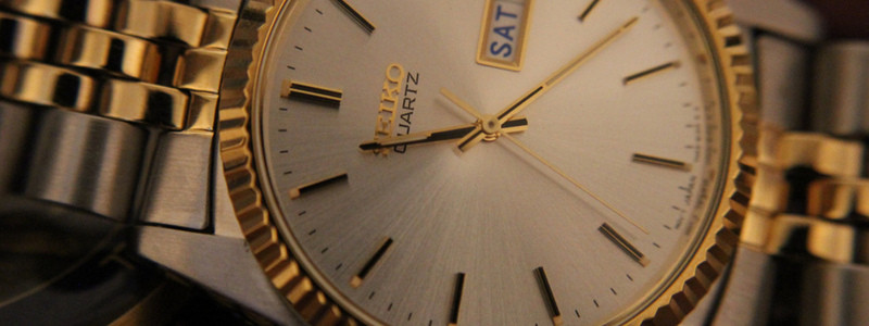
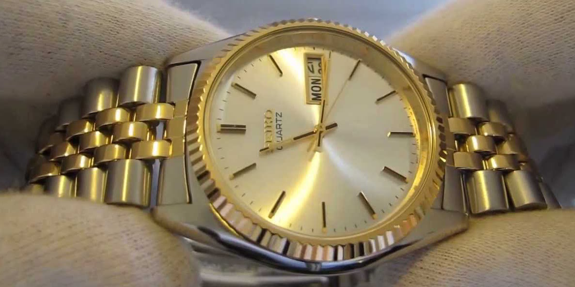
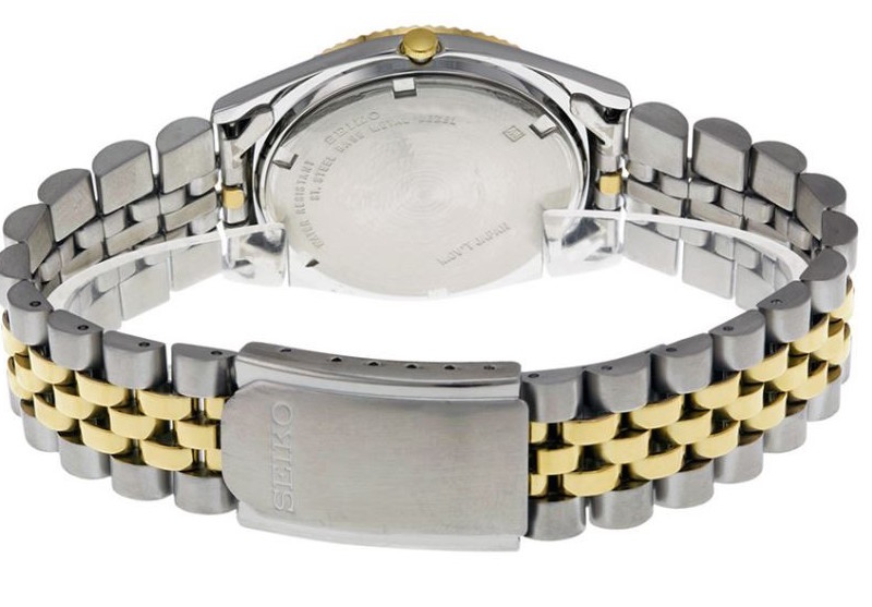
When I picked up the Seiko men’s SGF204 stainless steel watch, the first thing I noticed was the band color scheme. I normally dislike gold in general, but the band has a balance of both gold and silver that has sort of a 1:1.5 ratio, respectively. This, coupled with the golden trim around the bezel make this watch look really slick. The way that the golden center links on the band converge into the coin-edge bezel is almost seamless, so I really have to commend Seiko on their design choice. I think it looks great.
The SGF204 is a standard Seiko dress watch, so the dial is clean and doesn’t have anything flashy plastered on it; no annoying big or edgy fonts, no huge numbers, etc. I enjoy the simplicity of the style of the numbers on the dial as well. Other than 12 o’clock, each number is represented with a black roman-numeral 1 — “I”. 12 o’clock is given a roman-numeral 2 — “II”, and I this is a dial design I really, really like.

Though it’s the same size as other common Seiko dress watches, it really doesn’t look as big or bulky on the wrist. I personally credit this to the sleek design of the band and case, as opposed to the actually construction of the watch itself. The way that the colors synergize with the shape design of the watch make it deceptively slender-looking. I also think the design of the crown is another important reason, but I’ll take about that in a moment.
Comfort On The Wrist
The SGF204 isn’t too heavy, but it definitely feels solid and you could probably throw it as far as a baseball, though I wouldn’t recommend doing that. The crown is super small and really helps divert the attention to the case and dial of the watch. I personally dislike giant crowns, so this is an awesome construction choice in my book. The other features are what you’d expect — quartz movement, folding clasp, date window, 99ft water-resistance, etc. They all work great, so there’s not much to say about them. Again, I love the fact that Seiko went with straight black for the date window font instead of red.

Final Thoughts
Like I said, it’s like Seiko was reading my mind while I was thinking about what they could do better on their dress watches. The colors on the men’s SGF204 stainless steel watch are fantastic and don’t have a hint of pretention to them, the dial is simplistic and graceful, the band is beautifully attached to the case in a way that accentuates the watch’s design, and the date window doesn’t have a horrendous red font. The movement system is quartz and works without a hitch, the clasp is well-made and doesn’t rip off my arm hair, and the hurdle glass case shows no sign of scratching. Well done, Seiko; this is a great timepiece.
Leave a Reply