There comes a time in every watch collector’s journey when things start getting a little boring. Diver? Check. Pilot? Check. Dress watch? Check. Digital? Triple check. Sell some, buy some. Profit (yeah, right). Rinse, repeat. How is one supposed to break the cycle? Why, look no further than the Junghans Max Bill Chronoscope. A truly special watch, it will scratch that itch and then some. Guaranteed.
First things first. Let’s go through the full specs:
- Full reference: 027/4501.00
- Case material: Stainless steel
- Case diameter: 40 mm
- Lug-to-lug: 42 mm
- Thickness: 14.4 mm
- Movement: Calibre J880.2
- Power reserve: 48 h
- Frequency: 28,800 bph
- Day/date complication (German or English)
Who was Max Bill?
Swiss architect, industrial and graphic designer, painter, and general badass of all things design-oriented, Max Bill’s legacy endures to this day. An absolute master of the Bauhaus school, Bill’s style strongly favors minimalist, clean designs. His creations range from buildings and sculptures all the way to clocks and typefaces. We will see how his style is reflected upon the Chronoscope we are reviewing today.
Dial
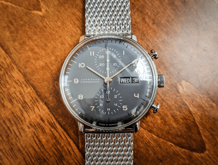
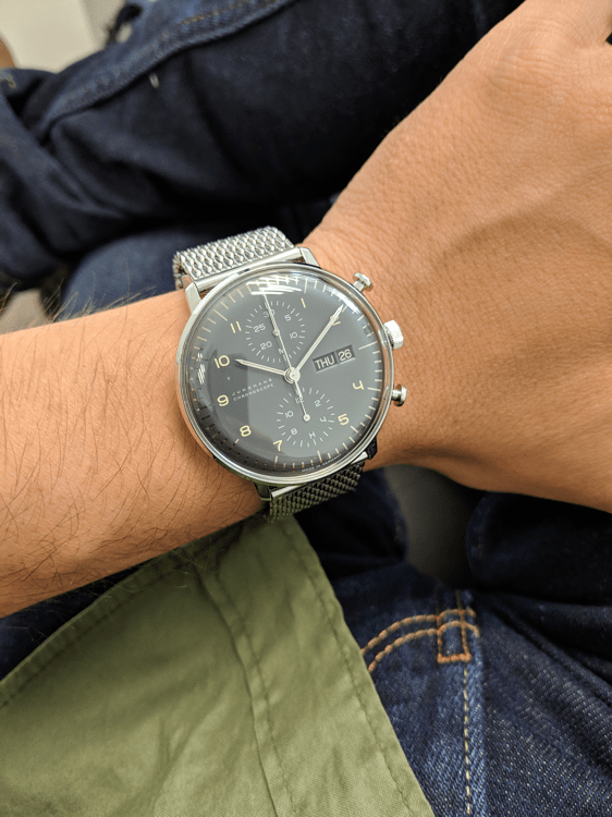
Usually the most striking feature of every watch, here the essence of a dial is elevated to its purest form. First, the color. Simply calling it “gray” would do a great disservice to the watch. I prefer the most accurate “anthracite gray” which is what Junghans states in their website. Depending on the way the light strikes, it varies from a deep shade of gray, to a very bright, handsome hue. It almost makes me forgive the only downside of anthracite: it doesn’t provide much contrast against the Arabic numerals. If you want maximum legibility, go for the white dial variant.
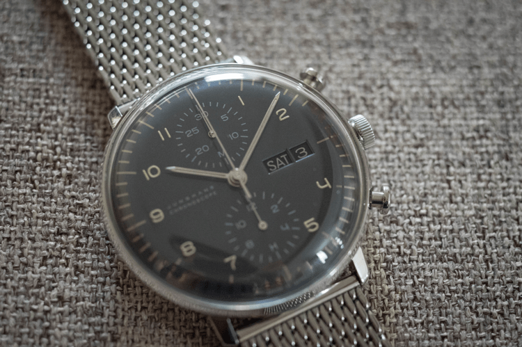
However, for reasons better known to Junghans themselves, the white variant doesn’t come with a day complication, so you’d have to make do with the date window only. Don’t fret, though, in the majority of cases you can read the time just fine in the anthracite variant. There’s another downside in the pretty dial: no seconds subdial to keep time. Of course, you can engage the chronograph to get some glimpse of life out of the dial, but I don’t think it’s a great idea to keep the chronograph running all the time due to the wear the mechanism would probably suffer. The dial looks frozen without a seconds subdial, but that’s a small cost to pay to keep the logo and the symmetry of the hour and minute subdials.
Typeface
This being a graphic design-oriented watch, I find it quite appropriate to dedicate a special section to the typeface on the dial. Please, take a moment to see the pictures. Seriously, look at them. Look at the gorgeous, exquisite shapes of the Arabic numerals. I’m no graphic designer, but I know good design when I see it, and good lord, sometimes I get the urge to lick those numerals or something. Check out that “4”, for heaven’s sake. I distinctly remember somebody online calling it “the best 4 in the business”, and I have to say I wholeheartedly agree. Plus, you get additional “4’s” in the date window! Talk about a sweet deal. Along with the hands, the numerals themselves are coated in SuperLuminova, so you can take a peek at them at night, too. Granted, the luminesce doesn’t last for long, but this is no diver’s watch. I’ll talk about water resistance later on.
Case
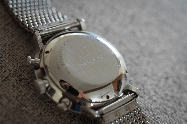
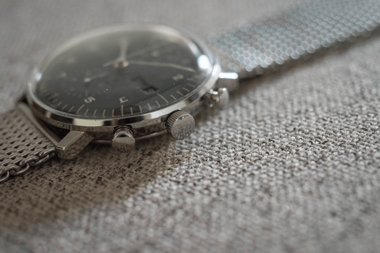
Stainless steel, nothing utterly remarkable here. On the back you will find Max Bill’s signature, which I think is a nice touch. As far as I know, Max Bill himself didn’t design this particular watch, unlike the simpler non-chronograph Junghans Max Bill models. However, there’s no denying Bill’s essence is at full display here, so I’ll let it slide. Apart from the case back cover, there is one little detail that makes me weak in the knees. Take a close look at those pushers. Have you ever seen more beautiful pushers? If you have, please send pictures. I think these pushers are in another league altogether. Their shape reminds me of old-school buttons and levers one might find in an airplane in 1940. I often catch myself playing with them and generally admiring their well-thought design.
Now, about the size. As you can attest from my past reviews, I strongly favor medium sized watches. Anything above 38 mm and I start to look like a kid wearing his dad’s watch. But I make an exception with the Chronoscope, and that’s largely to the tasteful 42 mm lug-to-lug distance. Something about the overall proportions of the watch makes it a joy to wear. Combine this with a killer dial and you get compliments by the dozen (true story).
Crystal
We get plexiglass here. I know, sapphire fans will endlessly ramble about how their watches never get scratched at all, and I understand. When you are paying a premium, scratches should be the least of your worries. But you can’t create beautiful distortions with sapphire. I’ve found time and time again that, when you want a dome, you use acrylic, full stop. Whenever you have the chance, take a trip to your nearest Omega AD and ask to see their Hesalite and Sapphire Moonwatches side by side. That’s all you need to convince yourself there is no contest at all. Besides, whenever you scratch your acrylic watch, Polywatch is there for you. Or you can limit scratches in the first place with a WATCHPOD travel case.
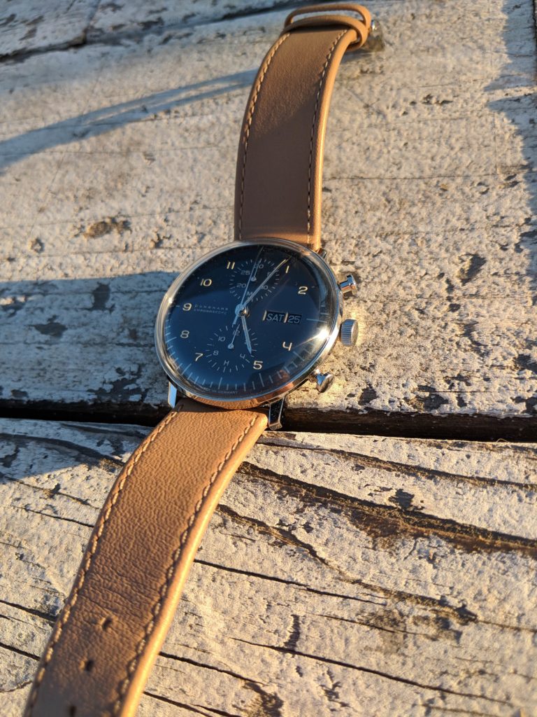
Having said that, let’s talk about the acrylic crystal of the Chronoscope. It sits really high. The thickness of the watch at the highest point of the dome is 14.4 mm. Of course, this is a subjective matter. Some people will love it, some won’t. I personally don’t mind it much, but do keep it in mind.
Movement
The J880.2 calibre is based on the Valjoux 7750 chronograph. I understand Junghans did some modifications to the Valjoux model, but that’s all I know. However, and this might be a potential dealbreaker for some, the rotor in this particular model is loud. Like, really, really loud. You can even hear it moving around at arm’s length in a normal noisy environment. As with the high domed crystal, some will love the sound of the rotor, while some others won’t. Myself, I kind of like to be reminded that I’m wearing a mechanical piece. You can even feel the shifting weight of the rotor as your arm moves around. But seriously, there are people reporting this on YouTube. Do yourself a favor and go watch some videos so you can make up your mind about the rotor.
Water Resistance
None. Junghans states “splash resistant” in their website. Chronographs are traditionally susceptible to water, and I have a feeling this model in particular would suffer a lot. Too pretty to wear rough, I guess.
Strap
I’m kind of torn on this one. Sometimes I like it, some other times I think it feels cheap. As you may have gathered by the pictures in the review, I use my Chronoscope on a Milanese strap. Something about the original leather strap puts me off. It’s not bad per se, not at all, but I wish it was a stronger shade of brown. Then again, the color goes perfectly well with the Arabic numerals in the dial, so I guess… give it a chance?
So, that’s it for today. All in all, a terrific addition for your collection if you want to spice it up and add something different. I’ve gotten more compliments on this watch than on all of my other watches combined. Get a feeling of the noisy rotor before buying, and keep a tube of Polywatch handy in case you get it. But mostly, get to enjoy it! After all, that’s what we really pay for.
You can visit the official Junghans website by clicking here.
Leave a Reply