You probably know their story by now. Former school teachers and watch aficionados Lorenzo and Lauren Ortega decided to call it quits on their careers and dive head-first into the scary world of microbrands, creating some of the most acclaimed and accessible timepieces of the last five years. Released in 2018, the first generation Lorier Neptune was an astounding success, at least judging from the glowing reviews from satisfied online users. Word of mouth spread like fire, and soon the venturing couple started to design more watches. Fast forward to 2021 and the Lorier Safari is all the rage, while the rest of their catalog, though still limited in quantity, is mightily impressive in its quality and attention to detail.
Today I have the pleasure of taking a closer look at the third generation of the Lorier Neptune, which packs significant upgrades over its first iteration. But as always, let’s get the basic specifications out of the way:
- Case material: 316L stainless steel
- Case diameter: 39 mm
- Lug width: 20 mm
- Lug-to-lug length: 47 mm
- Thickness: 12.7 mm
- Water resistance: 200 m
- Movement: Miyota 90S5
- Frequency: 4 Hz (28,800 bph)
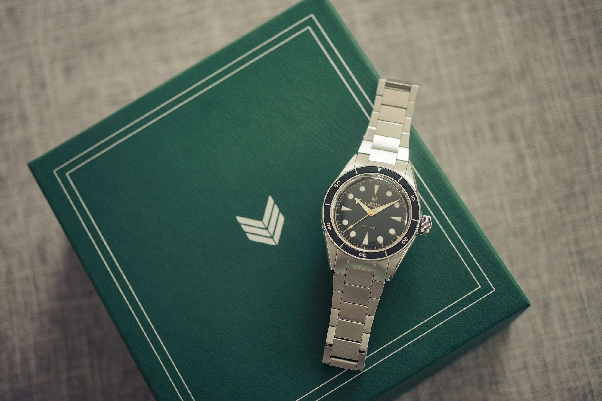
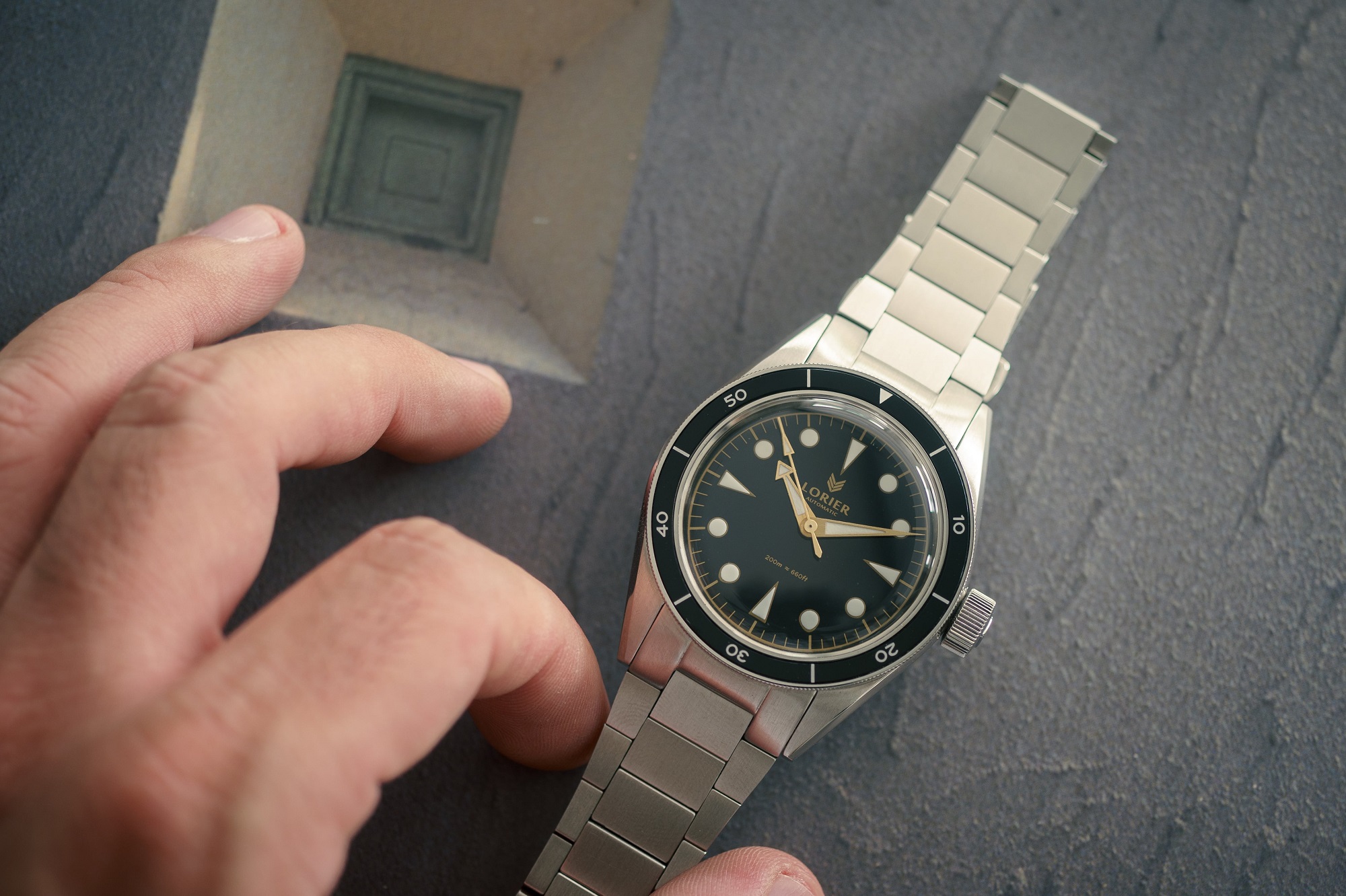
Case
39 mm. Yes, YES, this is the way. One is supposed to wear the watch, not the other way around. Considering the average male wrist size is around 7.25 inches, there is absolutely no reason to release dozens of 42+ mm watches each year. Even the most successful diver watch of all time has kept it at a sensible 40 mm diameter for the most part of its lifetime, and we know divers are meant to wear big.
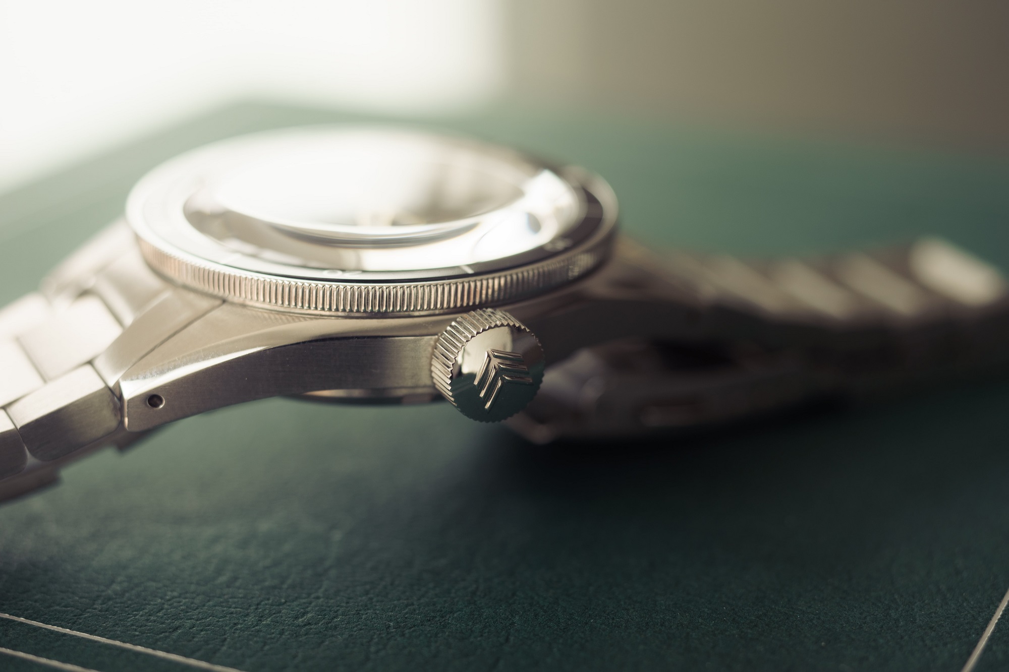
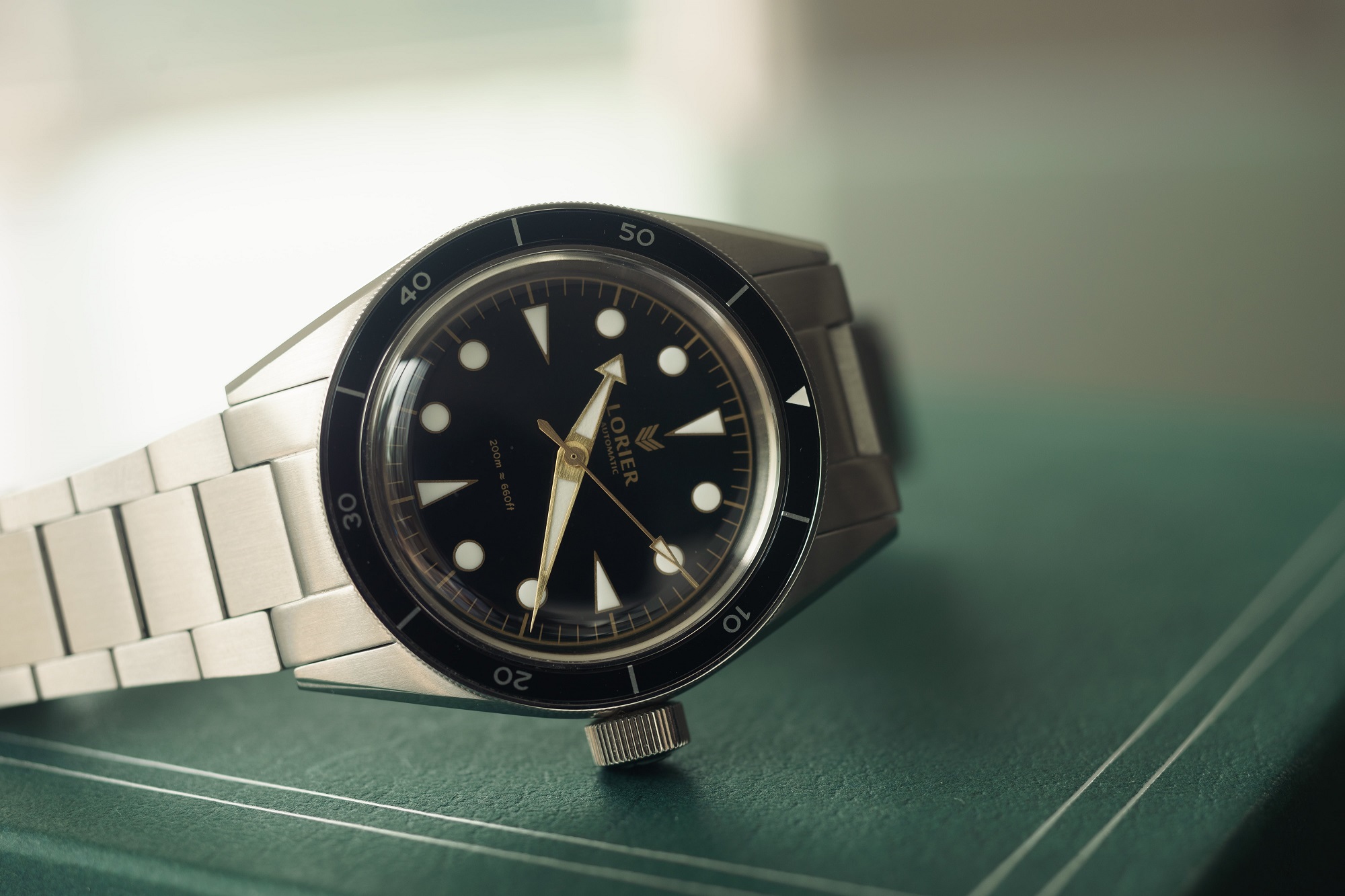
The Neptune SIII wears like an absolute dream, and this is coming from a 36 mm diameter fanboy. But this is not just about size. The case hugs the wrist quite nicely thanks to the beautiful albeit slightly long lugs. The alternating brushed and polished surfaces elevate the watch from sporty to smart casual, and the 12.7 mm thinness (crystal included) allows the watch to pair well with a suit. The caseback is fairly minimal and displays the Lorier logo in a circular fashion, while the oversized signed crown is quite attractive and grippy, owing to its large teeth.
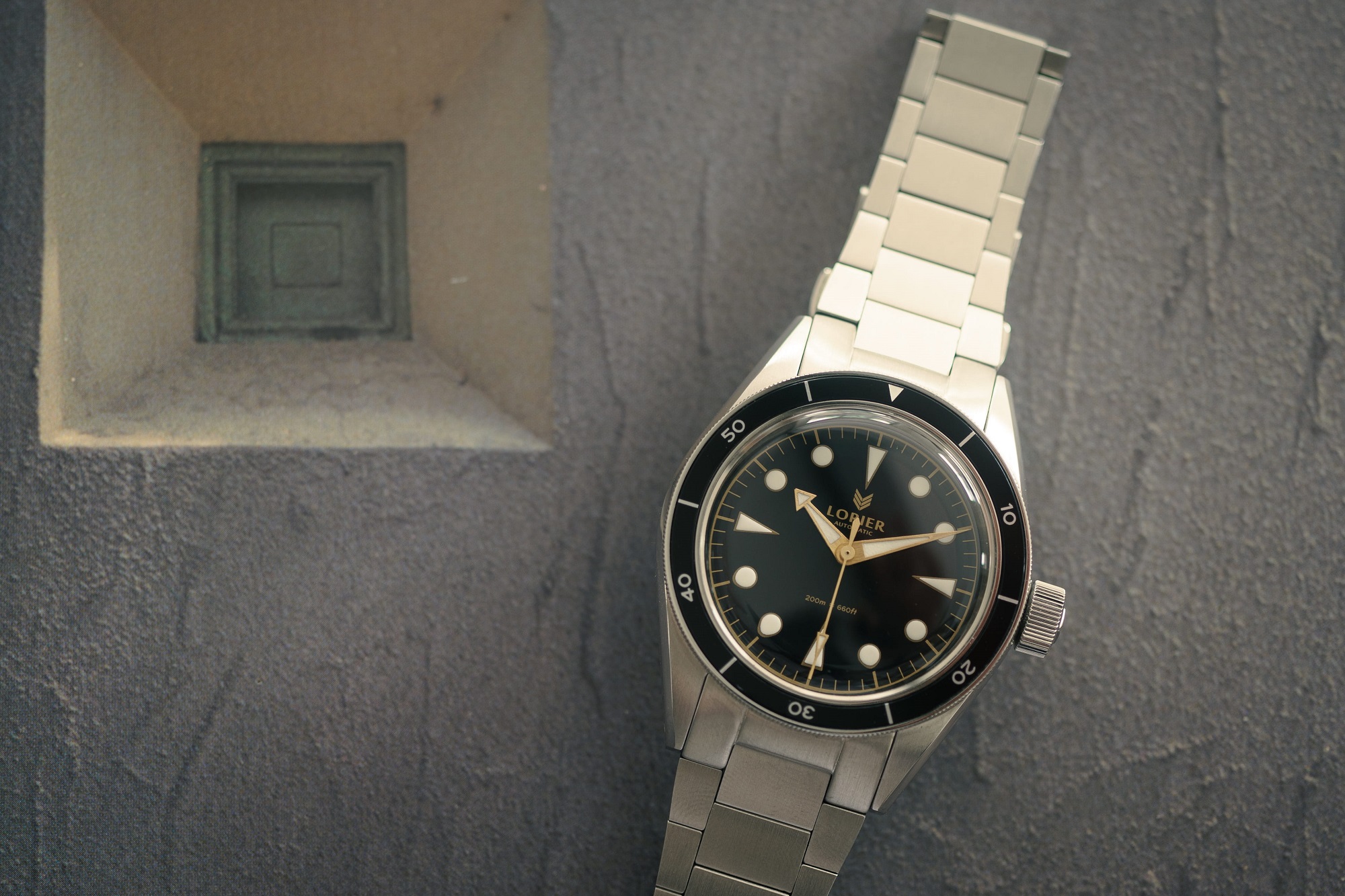
Dial
The Neptune takes its design cues from legendary diver watches of yore. The broad arrow hand of Omega, the svelte case profile and hour markers from Rolex, and the thin bezel insert reminiscent of Blancpain all come together to create not a frankenwatch, but a new authentic timepiece in its own right. The Neptune is tastefully put together, and at no point did I catch myself thinking of it as a derivative piece, not even as a homage.
The dial is sober and utilitarian. The large hour markers are meant to be read at a glance. There is no date window breaking symmetry. No nonsensical miles-long text covering half the dial. Just the right information you need when glancing at the watch.
At night, the BGW9 Superluminova gets the job done. It is not quite as bright as C3 lume, but the large area of application and its lasting power more than make up for it. Moreover, during the daytime, the hour markers are pearly white, which cannot really be said of watches sporting C3 and its yellowish hue in direct sunlight. However, I wish the triangle markers at 12, 3, 6, and 9 were filled to the tip with lume. Their current application is cut a little short and looks awkward. Also, I think the dial could be further improved by slightly enlarging the marker at 12 to differentiate it from its counterparts. As it is, there is no way to tell them apart in the dark.
Crystal
Even as a self-professed hesalite fan, I must admit that, legibility wise, sapphire is far superior. Granted, the distortions achieved by acrylic are absolutely mesmerizing, but several times I was forced to read the watch straight-on just to properly tell the time. That being said, I still maintain that hesalite is a great choice in this price range, easily outperforming the dull optics of mineral crystals.
As for scratches, there is no need to worry at all. On my first day wearing the watch, I managed to bang it hard against the doorknob (as one does), leaving an ugly scratch just off the center of the crystal. A couple of minutes polishing the crystal with Polywatch did the job, leaving the crystal as good as new.
Movement
New to Series 3 is the Miyota 90S5 caliber, a very fine choice for a watch in this price range. The 90S5 is a marvel of Japanese efficiency and a massive upgrade from the NH35 used in previous generations, given the fact that the Miyota does not include a ghost date complication.

This helped shave almost 1 mm of the thickness of the case, and of course, the crown can now be operated in two positions, as should be for a watch without a date complication.
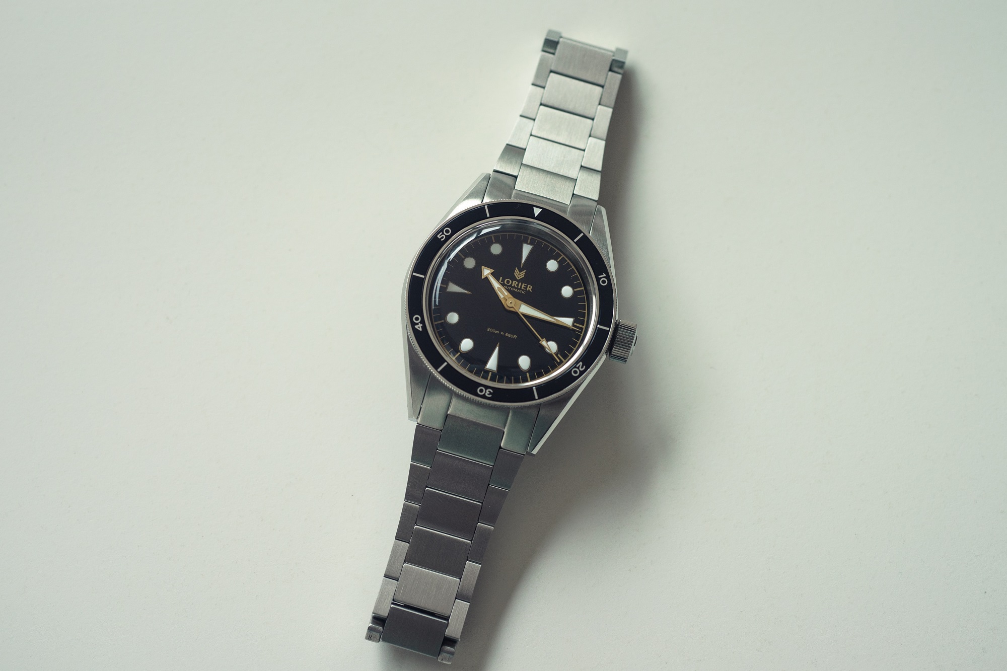
Bracelet
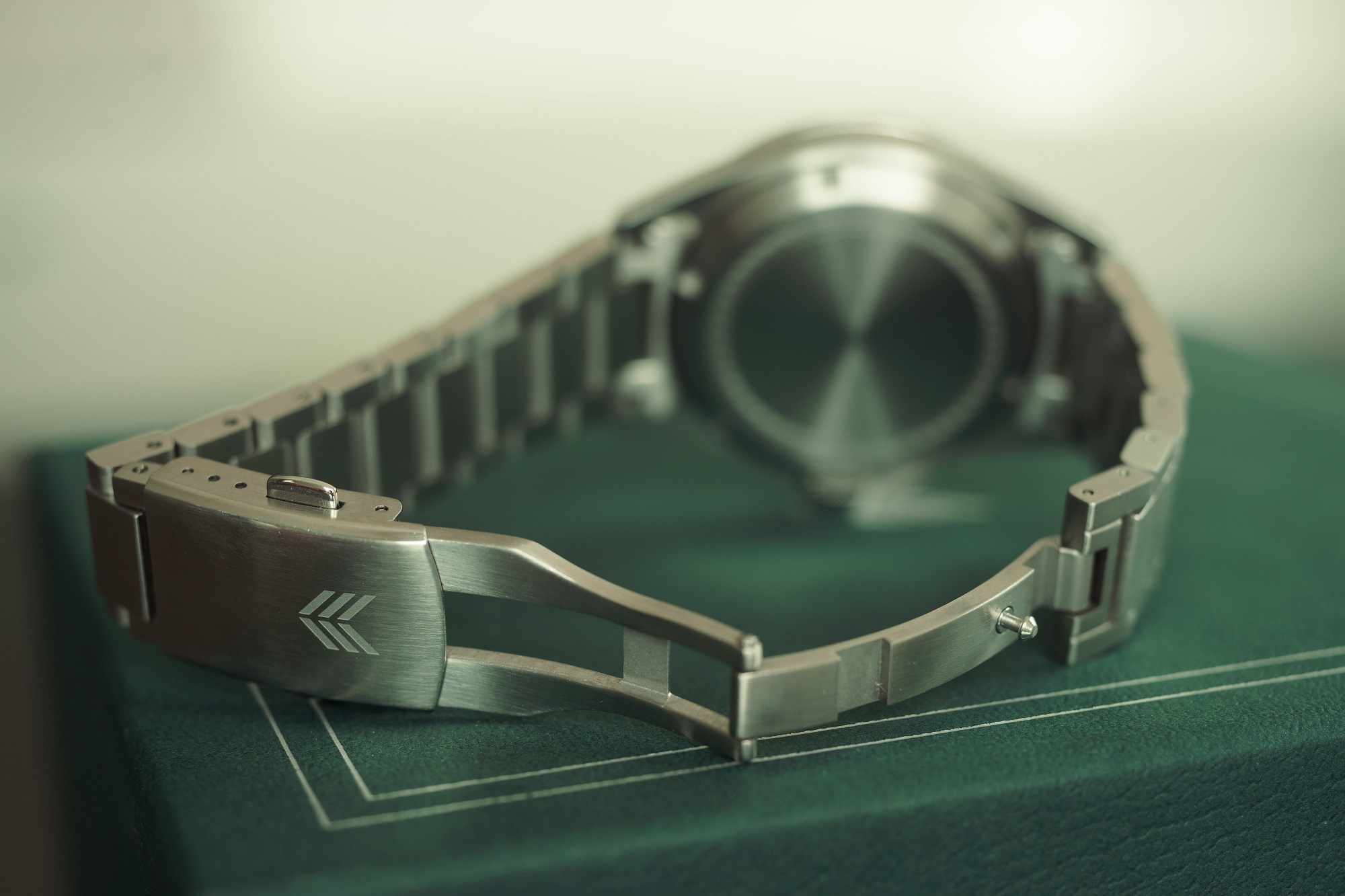
The bracelet of the Neptune is truly an exercise in great design and craftsmanship. While it can’t compete with bracelets twice its weight, it nevertheless is well proportioned and, dare I say, handsome. It tends to pull hairs, though, at least for the first few days I wore the watch. The bracelet tapers from 20 mm to an elegant 16 mm at the signed clasp.
Closing thoughts
Having said all that, one might think I find no fault on the Neptune. Alas, I wish it were that simple. I would like to close this review on somewhat of a personal note. For some time now, I’ve been downsizing lots of stuff in my life, and that includes watches. I’ve come to realize I’m more of a one-watch man (well, two automatics and my beater Casio) and the Neptune was a perfect candidate. The Ortegas themselves envision each of their timepieces as the only watch someone might ever need, and I can definitely see why. After purging most of my collection (except for my beloved, ever-present SMP), I started lusting for the Neptune. My first impressions were overwhelmingly positive, and I was truly on the verge of getting rid of the SMP in favor of the Neptune. However, after wearing it for a week, a couple of issues swayed me back to the SMP. Mind you, this had nothing to do with the perceived difference in quality, which speaks loads of the exquisite craftsmanship and attention to detail of the Lorier. Rather, it was a matter of taste. First, let’s talk about the printed text on the dial. As I said, the Neptune displays just the right amount of text, but at least in the black/gilt variant, the text gets lost in the darkness of the dial. Tiny nitpick, I know, but I like my text contrasty and legible. I would wager this is not an issue in the black and white version, but at the same time, I think that color combination is a little lifeless. Second, the Neptune has no date window (as should be for a traditional diver), but in my line of work, I need to know the date at all times, and the week I wore the Neptune I had to constantly remind myself to take out my smartphone like a philistine each time I wanted to check the date.
It seems like a stretch to completely change course over those two tiny details, but here we are. I sold the Neptune at a slight loss (after all, I had to pay customs to get it delivered), but such is life. The way I see it, I got to try one of the most accessible, attractive, and well-made watches in recent memory for a small fee, and for that I can say I’m satisfied. Of course, my SMP would be in real trouble if the Ortegas suddenly decided to release a 38 mm Neptune Date, but, given their spotless record of keeping their designs rooted in tradition, I don’t think they will, and to be perfectly honest, I wouldn’t have it any other way. Long live classic and beautiful design.
For more information on Lorier Watches visit their official website here.
Really great write up Ulises, especially appreciated is your talent for separating the watches design and performance from your own preferences.
Thank you so much for your kind words. Have a great day!